Do Gem Downloads Really Correlate with Gem Usage? Survey Says: No
Update 10/21/11: See the explanation of why the download count might be such an unreliable indicator of popularity, read Why are the Numbers So Whack? Plausible Explanations for Crazy Gem Download Counts
We tend to have a naïve way of comparing gem usage in the Ruby world. When the argument is made that a certain gem is used more than another, the supporting evidence tends to be the total download counts of each gem as reported by RubyGems.org. Sites like The Ruby Toolbox even use this number as the primary metric of popularity. However, the data I’ve been analyzing over the last few days indicates that, in fact, download count is actually not that strongly correlated with usage outside of the Rails gems themselves (rails & dependencies), regardless of how you define “usage”, and therefore a poor indicator of general gem popularity. The analysis shows that watchers and forks (from Github) is a slightly better metric, but also not all that strongly correlated to gem usage. In short, quantifying gem popularity through metrics like download count and watchers are simply not reliable. Performing real world surveys are a much better (and probably the only reliable) indicator of popularity.
What Data Did I Use?
This post is actually heavily influenced by the survey recently started by GemStats.org. The goal of the survey was to collect sample data with which to analyze true gem usage; they, like me, had a similar hypothesis that download counts from RubyGems.org was not all that representative of gem usage. The site is run by Nick Plante and Brian Cardarella, and since I know both of them fairly well, I was able to coax them into taking a peek at the data they have been collecting. GemStats.org managed to capture 800-900 Gemfiles from production applications using Ruby with over 2,100 gems in use. I think this is a reasonable sample size with which to analyze data.
In addition to using data from GemStats, it also turns out that NewRelic published anonymous gem usage statistics for their hosted Ruby applications as well. Their sample size was much larger (10,000 gems), but I only picked the common gems between both samples, over 95% of the gems in GemStats’ data.
Both data samples are listed at the bottom of this article with a link to the small graphing application I wrote to generate all of the graphs on this page. Note that all graphs display a “percentage” of usage/downloads, not absolute values. These are normalized values with respect to the largest values in the respective sets so that the two data sets can be compared on a similar scale. The absolute download and usage values are published in the data sets provided at the bottom of this article.
Finally, total download counts (not per-version) were retrieved from RubyGems.org for each gem using the web API. When the term “downloads” is used, it refers to the download tally from RubyGems.org.
Caveat About Rails Bias
It’s important to note that both of these data samples are heavily centered around Ruby usage in the Rails world, and therefore there might be some skewing of data for certain types of gems. That said, the important part of the results are not which gems are more popular than others, but the fact that over all gems, the correlation tends to be weak. Also keep in mind that 2,000 gems are listed here, which frankly is quite a lot; a brief reading of gems in the list seems to show that many different types of libraries pop up, from production tools (rack), to development / workflow tools (rake, rspec, thor), to debugging tools (ruby-debug), to documentation tools (yard, rdoc) and others. I’m fairly confident that the list of gems are a representative sample of the various things Ruby is used for, and I say this as a Rubyist who does not focus on web applications.
Conflicting Samples: Defining “Usage”
One difference between GemStats.org and NewRelic’s data sets are the way they collected data. This difference actually turns out to be a blessing for the analysis, because it introduces more possible explanations for why the results are what they are. The issue is ultimately how they defined “gem usage”, and this is a pretty important part of the analysis, given that this is our primary variable.
In short, GemStats.org asked for your Gemfile, whereas NewRelic collected results from Gemfile.lock. This makes a big difference, because the lock file contains all dependencies of gems you use, not just the gems you directly ask for. GemStats.org requested users supply them with the directly used gems in order to collect a much more accurate sampling of libraries that developers actually knew about and actively asked for. Counting this way avoids double-counting of gems and should theoretically yield more accurate results.
Think about it this way: when you ask for a library and that library depends on ruby_parser, it’s not because you are using ruby_parser when you use that library. You probably never even touch parsing code. Therefore, your code is not using ruby_parser, and it shouldn’t be counted as “used” by your code. On the other hand, NewRelic’s approach to usage includes all dependencies. In other words, when you use some library that depends on ruby_parser, their interpretation is that you are also “using” ruby_parser.
I realize that these two different approaches to “usage” are conflicting. Luckily, we will see that the conflicting interpretations actually have little bearing on the results since both samples have a weak relationship with downloads. Therefore, the actual interpretation of usage is not even relevant. But don’t take my word for it…
The Analysis: Big Picture
Let’s start with the big picture and drill down to the interesting data. This means we first want to look at the overall relationship between downloads and usage between both samples (GemStats.org and NewRelic). Here they are:
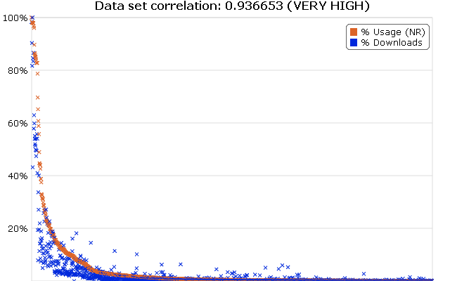
_Figure 1: All Used Gems vs. Total Download Count (NewRelic Data Set) (interactive graph)_
As we can see, the overall correlation is extremely high. So when averaging out all 2,000 odd gems, we do see that usage decreases with downloads. The idea that a popular gem should be a more downloaded gem is a fairly intuitive and logical one. It makes sense that a gem as popular as json (2.9 million downloads) will have more downloads than any of the lesser known ones (let’s take rye for example, with approximately 17k downloads). This is fairly obvious, and at this zoomed out level of comparison, popularity is in fact correlated with downloads. But this is a fairly extreme case. It is important to note that although the overall picture seems to correlate, you may have noticed quite a lot of noise under the curve at the left hand side. This is where the data really gets interesting (and where the relationship goes crazy). We will be looking at this in a bit, but first, let’s see how GemStats.org’s sample looks:
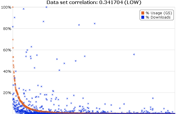
_Figure 2: All Used Gems vs. Total Download Count (GemStats.org Data Set) (interactive graph)_
Wow, that is some messy stuff. It turns out, over all gems, the way you define “usage” does have a wildly drastic effect on the relationship. If you subscribe to the idea that a gem is only used when you directly ask for it, and not via dependencies, then downloads never correlates strongly with usage, and we could theoretically stop the analysis here.
Even with this wildly varying initial picture, there is something both graphs seem to agree on; and that is that there is a huge mess under the curve on the left side of both graphs. It wouldn’t be a thorough analysis if we didn’t investigate what this mess was, and why it was happening. So let’s zoom into the curve.
Zooming into the Curve
It was already established that the extremes of each side of the overall data set are likely to vary less than the middle. This is because you simply can’t have “the most popular gem” without also being “[one of] the most downloaded gems”; it just would not make sense. So there is no disputing that Rails is not one of the most popular gems. The question is: given a gem that is ~10% more downloaded than another, which one is more popular? Can we make a prediction with any reliability about it being the more downloaded one?
To analyze this, we are going to look at the first few hundred gems for NewRelic’s data only. We’ve already established that GemStats.org shows pretty much no correlation, so zooming into the graph won’t help. We look at the first 50 or so libraries just to confirm our previous result in the NewRelic analysis: that the extreme left of the curve is correlating with downloads. Let’s see:
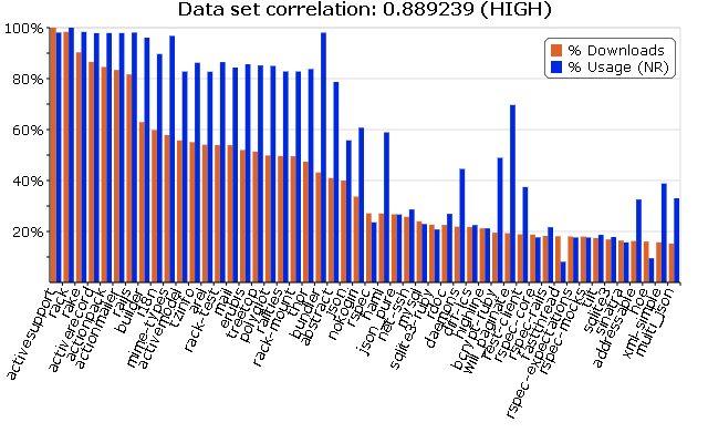
_Figure 3: Download Count of 50 Most Downloaded Gems vs. Usage (NewRelic Data) (interactive graph)_
There we go, the correlation coefficient provided at the top of the graph is still fairly high (though slightly lower), and the two sets look visually similar too. But here’s something interesting: we can see that there is a dropoff at around nokogiri (middle of graph), and it starts getting messy. But what happens when we move past the first 25 gems and show the next 50 of them?
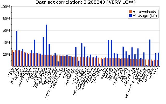
_Figure 4: Download Count of 25th-75th Most Downloaded Gems vs. Usage (NewRelic Data) (interactive graph)_
The difference is striking. We’ve gone from a very high correlation to a very low correlation by simply omitting 25 libraries. The relationship looks almost completely random here, and there seems to be no indication about download vs. usage at all. Maybe our sample size is too small. After all, if we calculate the correlation of a small set, we are obviously introducing a lot of noise into the computation. So let’s go from the 25th to the 225th gem, giving us 200 gems to sample from. That should cancel out the noise.
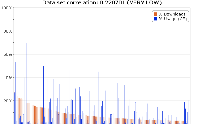
_Figure 5: Download Count of 25th-225th Most Downloaded Gems vs. Usage (NewRelic Data) (interactive graph)_
It got even worse! In fact, the correlation is extremely low for the next few hundred gems until the right side of the graph where things settle down.
So what is it about those first 25 gems that influences the correlation so heavily?
It’s All About the Rails
It turns out the answer is “Rails”. If you look at the first 25 gem names, you’ll see that the majority of those gems all happen to be part of Rails core or depended on by Rails. A full list of Rails gems and and dependencies can be seen here (remember, NewRelic counts dependencies as “part of” Rails usage). As an exercise, let’s see what the relationship on downloads and usage looks like just on these Rails / dependency gems:
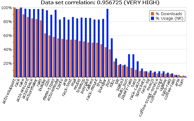
_Figure 6: Download Count vs. Rails Gems / Deps (NewRelic Data) (interactive graph)_
Once again, the correlation is extremely high (almost perfect, in fact). Okay, but what about if we counted the top 50 most downloaded gems that were not Rails or depended on by Rails? What does that graph look like?
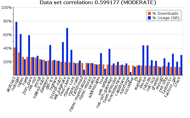
_Figure 7: Download Count of Top 40 Non-Rails Gems vs Usage (NewRelic Data) (interactive graph)_
This is quite a contrast to Figure 3, and the correlation is significantly different when we don’t consider the Rails core gems. Remember, we are still looking at the most downloaded gems, but those not used by Rails (and not downloaded with a “gem install rails”).
So if we can conclude one thing, it’s that RubyGems.org download counts are representative of gem usage, but only if your library is Rails. If you’re talking about another library, it’s a whole other ballgame.
What About Watchers & Forks?
When GemStats.org initially launched the survey, some people were questioning why surveys were needed at all, and why this data couldn’t just be grabbed from a better source. Sure, download counts may not be accurate, but there must be some representative value out there, right? What about watchers and fork counts on Github?
This is a good question, and something that we have the data to investigate. So let’s take a look and see if this might be the answer. First, though, we should do a little control experiment and see if watchers and forks are even related to each other in the first place. If so, we can consider them as the same metric, otherwise we will have to perform two separate analyses.
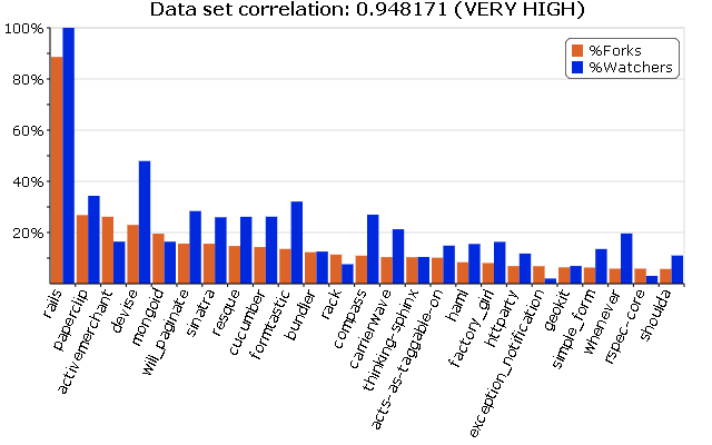
_Figure 8: Watchers vs. Forks of Top 25 Popular Projects (interactive graph)_
So it turns out that these two numbers are extremely highly correlated (almost perfectly). That means we can pretty much exchange one for the other when comparing against usage. Of course, we will show both forks and watchers in our graphs, but we will only calculate correlation against watchers in the following graphs, just to make it easier on the math.
So let’s see, what does our watchers and forks actually look like if we plot against usage? Let’s replace downloads with watchers/forks and see the relationship for a set of roughly 90 gems, first using NewRelic’s data set of usage, and then GemStats.org:
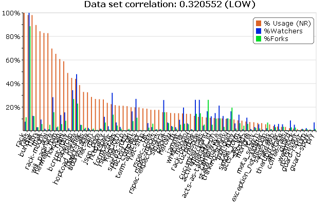
_Figure 9: Usage vs. Watchers/Forks of Top Popular Projects (NewRelic Data) (interactive graph)_
Oh my, there doesn’t seem to be a correlation here. It seems that NewRelic’s sample on gem usage has a very weak relationship with the number of watchers or forks a project has. That’s unfortunate. Does GemStats.org’s data do any better?
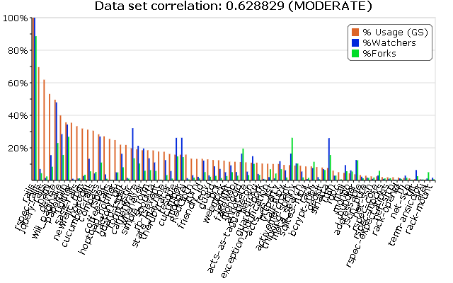
_Figure 10: Usage vs. Watchers/Forks of Top Popular Projects (GemStats.org Data) (interactive graph)_
Hmm, well, it’s not extremely reliable, but it seems to be a lot more closely tied to watchers and forks than NewRelic’s data. Maybe that does say something about the accuracy of counting dependencies in your sampling of gems?
It would be nice to have more gems to look at here. Admittedly, the sample of gems is fairly small for this portion of the analysis. This is mostly because it’s not all that easy to map gems to github accounts, and not all gems even use github, which makes the comparison slightly more problematic. I am currently gathering more gems to test with, but I’m not expecting this result to change an awful lot.
So What is the Popularity Metric?
Remember, the sample data retrieved from GemStats.org and NewRelic’s surveys give us actual usage of gems in the wild. This should be the most reliable and accurate metric of popularity. However, we can’t just start sampling real world apps all the time to judge popularity, so the question we asked was: are there any metrics that can act as a reliable stand-in for performing surveys?
It turns out the answer is: not really. Unfortunately, the best metric I could find so far is performing these manual surveys and collecting real world results. No other metric holds up reliably enough to be considered a proper indicator of popularity. The closest I was able to get to a reliable indicator was using watchers or forks of a project, but that is only if you consider GemStats.org’s version of “used” (ie. indirect dependencies are not considered as “used”). Even then, the correlation coefficient for the data I have is 0.62; I am not a statistician, but as far as I can tell, this roughly translates to: “might be wrong 38% of the time”. Not all that reliable.
Are there any other metrics we could possibly use as an indicator? Would any of them be more reliable than what we are currently doing to estimate a gem’s popularity in the wild? I’d love to hear your ideas. Maybe it’s just as simple as collecting data from a “Like button” on project pages. Until we can find a reliable metric, we should try to participate more in community surveys like GemStats.org, since data like this is a much better way to find out what libraries are really being used by Ruby developers. I would also recommend that we try to avoid using download counts as an indicator of popularity as is currently being done on sites like The Ruby Toolbox.
Appendix: Data and Visualizations
All data and visualizations are being made available on Github under the gemstats_analysis project.
The data analyzed was acquired from Brian Cardarella (for GemStats.org’s sample) in gist:1290576 and Brian Doll (for NewRelic’s sample) in gist:1251372. The data was then combined, normalized, and reformatted to CSV format. The CSV format used to generate all graphs can be found in the data directory of the gemstats_analysis project (data.csv is the main data file).
All graphs were generated using RGraph using a custom built Javascript page to quickly create custom graphs. The Javascript code is available as part of the gemstats_analysis project (index.html). These graphs have interactive features (links to each graph are beside the figure) and can be viewed live by visiting http://lsegal.github.com/gemstats_analysis
 I'm Loren Segal, a programmer, Rubyist, author of